

RAYMARINE upgrades its identity with a new logo
Raymarine has decided to upgrade its identity to better align with their superior product offering and to bring more excitement to the brand. Raymarine undertook the project of updating the brand identity very seriously. Raymarine is one of the most recognized marine electronics brands in the world and it wanted to make sure it capitalized on its existing brand equity not wanting to alienate those who know and love the Raymarine brand. For the new Raymarine the intention was to inject energy and momentum into the brand and also create a brand identity that aligns with the exciting Raymarine product launches and breakthrough innovations that FLIR will bring to the marine market in 2017.
The New Logo
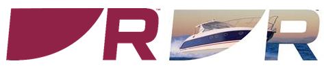
The new Raymarine logo has been modernized, but still retains the strong visual heritage of the old Raymarine. The new logo retains some of the most recognizable elements of the old logo, including the bold “Raymaroon” colour and the distinctive large “R.” The new logo now feels more contemporary and conveys energy and movement- all positive attributes for a company that creates innovative products that help our customers get underway on the water.

New Raymarine Design Language
With the new logo identity, Raymarine also created a whole new design language for the brand. To appreciate this new language, take a close look at letter “i” in the logo and you will see a new graphical shape in the dot above the “i". The new shape is inspired by a boat hull, a boat’s sail, or even the quadrant of a radar display- all visual cues that define us as “marine” and reflect our deep roots in marine navigation. Here you can see how this new shape will be used in the new Raymarine's marketing materials.
New Monogram
With this new design language Raymarine also created a new monogram to represent the brand. Like the double diamonds of FLIR or the well-known swoosh of a popular brand of sneakers, the Raymarine monogram is visual shorthand for the brand and it affords us more opportunities to represent the brand across different mediums.
New Positioning and Tag Line
Along with the new identity we are launching a new Raymarine brand campaign that will coincide with our new product introductions at the Miami boat show. The new campaign positions Raymarine around two core strengths:
- Superior Performing Products and Sensors- as evidenced by our best in class radar, autopilot, thermal, and sonar product lines
- Powerful and Intuitive User Experience – delivered by our leading edge MFD platforms and LightHouse operating system
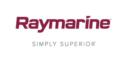
The sum of these two attributes becomes our bold new tag line!
A Brand by FLIR
In 2014 Raymarine introduced the “by FLIR” element to the Raymarine identity. This change was designed to help reinforce the linkage between Raymarine and the FLIR parent brand. With the new and improved Raymarine identity the linkage to FLIR will be subtler and the consumer facing Raymarine identity will no longer have the “by FLIR” below the logo. Instead Raymarine is employing “a brand by FLIR” linkage on documents like catalogs, brochures, and the website.
Transition
The transition to the new identity is currently underway. Raymarine has already introduced the new logo in trade show booths and the 2017 Product Guide and I am happy to report the new identity has been extremely well received by both internal and external audiences. All marketing assets going forward will use the new identity. The Raymarine website will be upgraded with new branding the first week of February.
